
Layout Section (when Layout Type is “Grid”)
To access these settings:
- Drag and drop the “Post Grid” widget onto your Elementor canvas.
- In the Elementor sidebar, ensure you are on the Content Tab.
- Expand the “Layout” section.
- Layout Type:
- Value:
Grid - Description: This dropdown option defines the overall arrangement of your posts. When “Grid” is selected, your posts will be displayed in rows and columns, forming a cohesive grid.
- Value:
- Grid Style:
- Description: This is a key feature that provides a wide array of pre-designed visual templates for how each individual post item within the grid will appear. These styles control the positioning of the featured image, title, excerpt, meta-data (like author, date), price (if applicable, e.g., for WooCommerce products), and action buttons (like “Read More” or “Add to Cart”).
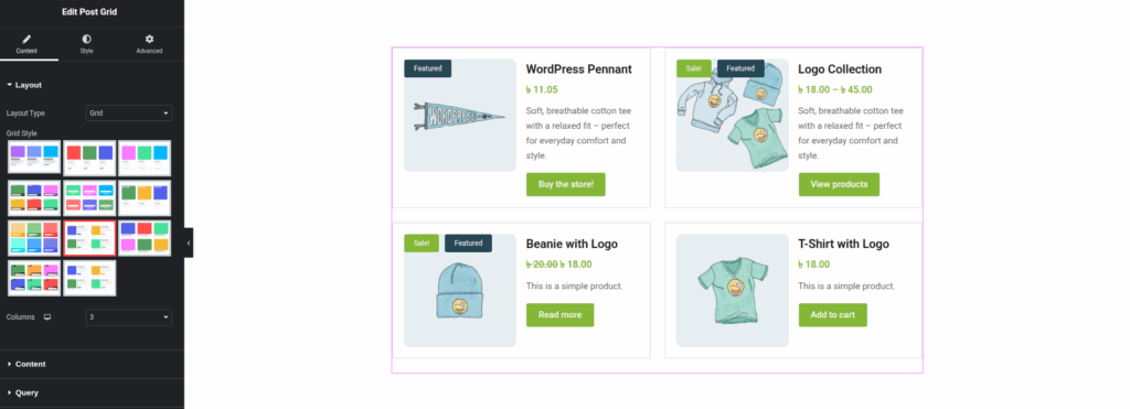
- Visual Representation (from
Edit-po-with-Elementor-07-17-2025_09_54_AM.pngandElementor-grid-plugin.png): The plugin typically offers a gallery of small thumbnail previews. Selecting one of these thumbnails (often indicated by a red border or highlight) instantly applies that design to your grid items on the live preview. - How it works (referencing
grid-layout-style.png): Once a “Grid Style” is chosen, the main Elementor canvas will update to show your actual posts rendered in that selected style. You’ll observe the layout of images, text, and other elements as defined by the style. For example, some styles might place the image above the text, others to the side, and some might include badges like “Featured” or “Sale” (as seen in thegrid-layout-style.pngexample you’ve provided, which also indicates product names, prices, descriptions, and call-to-action buttons). - Purpose: Allows for quick and easy customization of the grid’s aesthetic without needing to manually style each component.
- Columns:
- Description: This setting determines how many columns your grid will have across the screen. You can usually set different column counts for various device types (desktop, tablet, mobile) to ensure responsiveness.
- How to Use:
- Click the desktop icon to set the number of columns for desktop view.
- Click the tablet icon to set the number of columns for tablet view.
- Click the mobile icon to set the number of columns for mobile view.
- Use the numerical input field or the up/down arrows to select the desired number of columns (e.g., 2, 3, 4).