
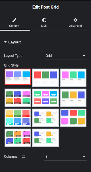
- Layout Type → Set to “Grid” (other options might include List, Slider,).
- Columns → Set to *3* (controls how many posts appear per row).
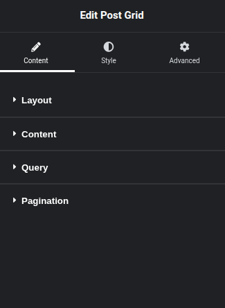
Content Section
This area defines which parts of your post ( image, title, excerpt, meta data) will be visible in the grid items and how they are displayed.
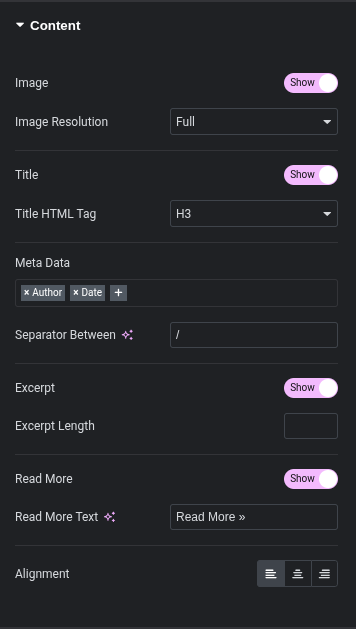
- Image:
- Toggle (Show/Hide): Use this switch to either display or hide the featured image for each post in the grid.
- Image Resolution: If “Show” is enabled, this dropdown allows you to select the resolution of the featured image. Options typically include:
- Full: Displays the original uploaded image size.
- Large: A large scaled version.
- Medium: A medium scaled version.
- Thumbnail: A small scaled version.
- Custom sizes defined by your WordPress theme or other plugins might also be available.
- Purpose: Choosing a suitable resolution helps optimize loading times and visual quality.
- Title:
- Toggle (Show/Hide): Use this switch to display or hide the post title in the grid items.
- Title HTML Tag: If “Show” is enabled, this dropdown allows you to select the HTML tag for the post title (e.g., H1, H2, H3, H4, H5, H6, p, div, span).
- Purpose: Selecting the appropriate HTML tag is important for SEO and maintaining semantic structure of your content. H2 or H3 are common choices for post titles within a grid.
- Meta Data:
- Description: This field allows you to select and order various pieces of post meta-information to display, such as Author, Date, Categories, Tags, Comments, etc.
- To Add/Remove:
- To add a new meta item, click the
+icon and select from the dropdown. - To remove an existing meta item, click the
xicon next to its name. - To reorder items, drag and drop them within the field.
- To add a new meta item, click the
- Separator Between: Define the character or string used to separate the displayed meta data items (e.g.,
/,|,-).
- Excerpt:
- Toggle (Show/Hide): Use this switch to display or hide a short summary (excerpt) of the post content in the grid items.
- Excerpt Length: If “Show” is enabled, this numeric field allows you to specify the maximum number of words to display in the excerpt. Leave empty for default excerpt behavior or a custom excerpt if defined in the post.
- Read More:
- Toggle (Show/Hide): Use this switch to display or hide a “Read More” button or link that directs users to the full post.
- Read More Text: If “Show” is enabled, you can customize the text displayed on the “Read More” button/link (e.g., “Read More »”, “Continue Reading”, “View Post”).
- Alignment:
- Description: These icons allow you to set the horizontal alignment for the content within each grid item (typically affecting text elements like title, excerpt, and meta data).
- Options: Left Align, Center Align, Right Align.
Documentation: Post Grid Plugin for Elementor – Query Settings
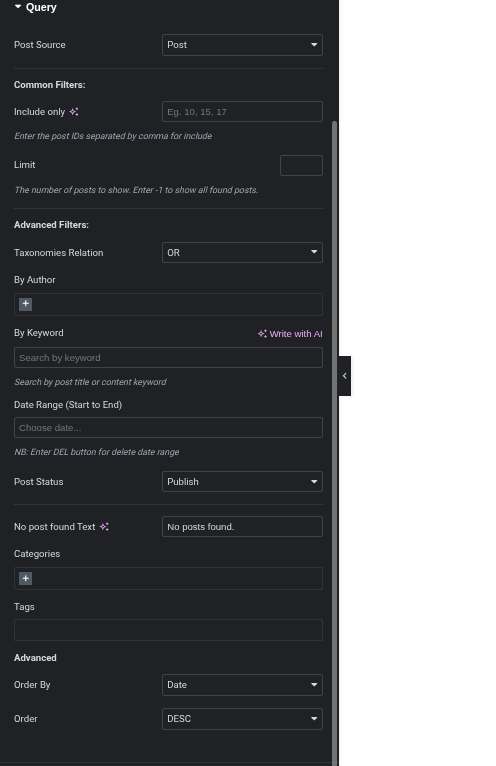
The Query section within the Content Tab of the Post Grid widget is where you define which posts, pages, or custom post types are pulled into your grid. This section allows for powerful filtering and ordering to display exactly the content you need.
Query Section
- Post Source:
- Description: This dropdown allows you to select the type of content you want to display in your grid.
- Common Options:
- Post: Displays standard WordPress blog posts.
- Page: Displays WordPress pages.
- Custom Post Type: If you have registered custom post types (e.g., “Products,” “Portfolio,” “Testimonials”), they will appear here.
- How to Use: Select the desired content type from the dropdown.
- Common Filters:
- Include Only:
- Description: This field allows you to include only specific posts by entering their numerical post IDs, separated by commas. For example,
10, 15, 17would display only posts with those IDs. - Purpose: Useful for hand-picking specific content for your grid.
- Description: This field allows you to include only specific posts by entering their numerical post IDs, separated by commas. For example,
- Limit:
- Description: Controls the maximum number of posts to display in the grid.
- How to Use: Enter a positive number to set a limit. Enter
-1to display all found posts that match your other query criteria. - Purpose: Essential for controlling the size of your grid and preventing excessive loading.
- Include Only:
- Advanced Filters:
- Taxonomies Relation:
- Description: When filtering by multiple taxonomies (like categories and tags), this setting defines how those filters interact.
- Options:
- OR: Displays posts that match any of the selected taxonomy terms.
- AND: Displays posts that must match all of the selected taxonomy terms.
- Purpose: Crucial for precise filtering when using multiple category or tag selections.
- By Author:
- Description: Filter posts to display only those written by specific authors.
- How to Use: Click the
+icon to add authors from a list. You can add multiple authors.
- By Keyword:
- Description: Search for posts by a specific keyword found in their post title or content.
- How to Use: Enter the keyword(s) into the input field. (The “Write with AI” option suggests AI-powered keyword suggestions or generation might be available).
- Date Range (Start to End):
- Description: Filter posts based on their publication date within a specific range.
- How to Use: Click “Choose date…” to open a calendar picker and select your start and end dates.
- NB: “Enter DEL button for delete date range” indicates you can clear the selected date range by pressing the Delete key.
- Post Status:
- Description: Filter posts based on their WordPress status.
- Common Options:
- Publish: Only display published posts (most common).
- Draft: Display posts saved as drafts.
- Pending: Display posts awaiting review.
- Future: Display scheduled posts.
- Private: Display private posts.
- Trash: Display trashed posts.
- How to Use: Select the desired post status from the dropdown.
- No Post Found Text:
- Description: Customize the message displayed if no posts match the query criteria.
- How to Use: Enter your desired message in the text field.
- Categories:
- Description: Filter posts by specific categories.
- How to Use: Click the
+icon to add categories from a list. You can include or exclude categories.
- Tags:
- Description: Filter posts by specific tags.
- How to Use: Enter tags, often separated by commas, or use an autocomplete feature if available. You can include or exclude tags.
- Taxonomies Relation:
- Advanced:
- Order By:
- Description: Determine the criteria by which the posts are sorted.
- Common Options:
- Date: Sort by publication date.
- Title: Sort alphabetically by title.
- ID: Sort by post ID.
- Menu Order: Sort by custom menu order (useful for pages).
- Random: Display posts in a random order.
- Comments Count: Sort by the number of comments.
- How to Use: Select your preferred sorting criteria from the dropdown.
- Order:
- Description: Sets the order of sorting (ascending or descending).
- Options:
- DESC (Descending): Newest to oldest (for date), Z-A (for title), highest to lowest.
- ASC (Ascending): Oldest to newest (for date), A-Z (for title), lowest to highest.
- How to Use: Select
DESCorASC.
- Order By:
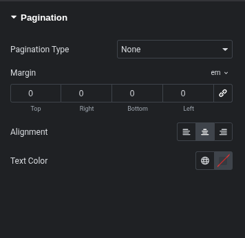
Documentation: Post Grid Plugin for Elementor – Pagination Settings
The Pagination section within the Post Grid widget’s Content Tab allows you to control how users navigate through your posts when the total number of items exceeds the “Limit” set in the Query section.
Pagination Section
- Pagination Type:
- Description: This dropdown determines the method of pagination for your post grid.
- Options:
- None: No pagination is displayed. Only the number of posts set in the “Limit” (from the Query section) will be visible.
- Numbers: Displays traditional page numbers (e.g., 1, 2, 3…) that users can click to navigate.
- Load More: Adds a “Load More” button that, when clicked, loads additional posts without refreshing the page.
- Scroll: (Likely “Infinite Scroll”) Automatically loads more posts as the user scrolls down the page.
- How to Use: Select your preferred pagination method from the dropdown. The available options below this setting will change based on your selection (“Load More Text” for “Load More” type, “Show Previous/Next” for “Numbers” type).
- Margin:
- Description: Controls the spacing around the pagination element. You can set individual margin values for the Top, Right, Bottom, and Left sides.
- Unit Selector: The dropdown next to “Margin” allows you to choose the unit of measurement (e.g.,
pxfor pixels,em,%,vw,vh).emis often selected for responsive typography scaling. - Link Values Button: The chain icon (linking button) allows you to either link all margin values together (so changing one changes all) or unlink them to set individual values.
- How to Use: Enter numerical values for each side. Adjust the unit as needed.
- Alignment:
- Description: Defines the horizontal alignment of the pagination elements (e.g., page numbers, “Load More” button) within the grid area.
- Options:
- Left Align: Aligns the pagination to the left.
- Center Align: Centers the pagination.
- Right Align: Aligns the pagination to the right.
- How to Use: Click the icon corresponding to your desired alignment.
- Text Color:
- Description: Sets the color of the pagination text (e.g., page numbers, “Load More” button text).
- Color Picker: Click the color swatch (the square with the diagonal line) to open a color picker, allowing you to choose any color. The globe icon might suggest global colors defined in Elementor’s site settings.
- How to Use: Select a color that complements your website’s design.