
Documentation: Post Grid Plugin for Elementor – Slider Layout Settings
When you select “Slider” as the Layout Type in the Post Grid widget’s Content Tab > Layout Section, additional options appear to customize the appearance and behavior of your post slider. This allows you to display your posts in a dynamic, navigable carousel format.
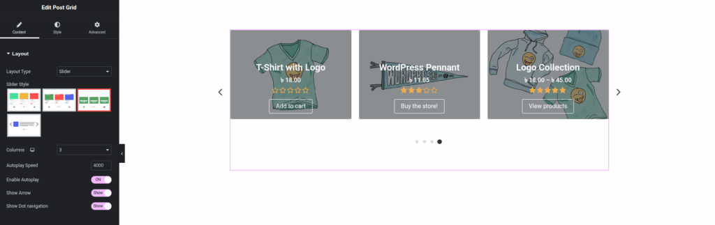
Layout Section (when Layout Type is “Slider”)
- Layout Type:
- Value:
Slider - Description: This indicates that your posts will be displayed in a carousel or slider format, allowing users to navigate through them horizontally.
- Value:
- Slider Style:
- Description: Similar to “Grid Style,” this offers a selection of pre-designed templates specifically optimized for slider display. These styles dictate the visual arrangement of elements (image, title, price, buttons, etc.) within each slide.
- How to Use: Click on the thumbnail image of the slider style you wish to apply. A border usually highlights the selected style.
- Visual Representation: (This is where the thumbnails of different slider styles from your image would be referenced in a real document.)
- Columns:
- Description: Defines how many post items are visible in the slider at any given time. This setting is often responsive, allowing you to set different column counts for desktop, tablet, and mobile devices.
- How to Use: Use the number input or dropdown to select the desired number of columns for each device type. For a slider, this dictates how many slides are shown simultaneously.
- Autoplay Speed:
- Description: Controls the duration (in milliseconds) before the slider automatically transitions to the next slide.
- How to Use: Enter a numerical value in milliseconds (e.g.,
4000for 4 seconds). Enter0or leave blank to disable autoplay.
- Enable Autoplay:
- Toggle (ON/OFF): A simple switch to enable or disable the automatic sliding functionality.
- How to Use: Turn
ONto make the slider advance automatically; turnOFFto require manual navigation.
- Show Arrow:
- Toggle (Show/Hide): Controls the visibility of navigation arrows (typically on the left and right sides of the slider) that users can click to manually advance or go back a slide.
- How to Use: Turn
Showto display the arrows; turnHideto conceal them.
- Show Dot Navigation:
- Toggle (Show/Hide): Controls the visibility of dot indicators (usually found at the bottom of the slider) that represent each slide and allow direct jumping to a specific slide.
- How to Use: Turn
Showto display the dots; turnHideto conceal them.